 The 2-Tone phenomenon was much more than a musical movement. It existed on multiple levels, culturally, artistically and socially. For me, the visuals and design of all things 2-Tone had as much to do with making it cool as the music and the bands did. While Jerry Dammers clearly had social change on his mind when he sketched out what he wanted 2-Tone and The Specials to be, he also approached the branding of the label and the bands on the label with the expertise of an experienced art director (his art school training clearly came in handy here).
 While Dammers deserves much of the credit for the iconic "Walt Jabsco" design and the black and white checkerboards most fans equate with the label, it was a young art designer named David Storey who worked in the Chrysalis Records art department who helped him to realize the look and feel of the albums we all know well today and who was the creative inspiration behind many others. Today, Storey is a renowned artist, painter and sculptor, but it was during the 80s and 90s when he worked in the music industry where he became known for his bold, innovative and influential designs. His best known work from this period was The Specials and 2-Tone, but he also designed all the memorable album covers for The Housemartins who followed in The Specials footsteps by incorporating a consistent look into all their albums.
Below is an article/interview that Storey conducted with Martin Aston of Q Magazine in 2004 titled. "From 2-Tone to the Beat Girl, ska had some of the most enduring designs in record label history" The article provides a fascinating inside look at how Dammers approached the art design of the band and label as well as the behind the scenes role that Storey played.
Almost as much as the music of 2-Tone, the label’s visual identity defined the ethos of the label, much the same as Jamie Reid’s cut-up collages for the Sex Pistols. “It was very much an anti-design ethos,” recalls designer David Storey, who, with John “Teflon” Sims, was responsible for translating Jerry Dammers’ ideas into reality. “Any talk of an art movement or ‘ism’ with Jerry would have raised a laugh. Stiff Records had popularised the, Fuck Art, Let’s Dance, slogan, and that was very much the bottom line. There's an honesty to what Jerry did, like punk in a way, but friendlier.”
Almost as much as the music of 2-Tone, the label’s visual identity defined the ethos of the label, much the same as Jamie Reid’s cut-up collages for the Sex Pistols. “It was very much an anti-design ethos,” recalls designer David Storey, who, with John “Teflon” Sims, was responsible for translating Jerry Dammers’ ideas into reality. “Any talk of an art movement or ‘ism’ with Jerry would have raised a laugh. Stiff Records had popularised the, Fuck Art, Let’s Dance, slogan, and that was very much the bottom line. There's an honesty to what Jerry did, like punk in a way, but friendlier.”
Storey’s introduction to 2-Tone was when The Specials first visited the Chrysalis art department, where he and Sims worked. “They were an impressive bunch, all sporting skinhead haircuts and Jerry without any front teeth,” an impressionable Storey recalls. “But talking to them, they were thoughtful, charming characters. I wasn't long out of university and found The Specials such a breath of fresh air. We were more used to pop star breezing into the art department on a clouds of cologne whereas Jerry would shuffle in anonymously, with his carrier bag full of reference bits and pieces.”
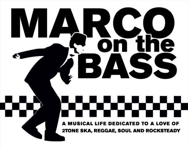
 From a crumpled carrier bag at their first meeting, Dammers unleashed the component parts that identified 2-Tone: the black-andwhite checkerboard line work; the rude boy label mascot known as Walt Jabsco; the powerful, stark simplicity of the content and presentation. Walt Jabsco had a curious genesis. The name came from an old American bowling shirt that Dammers owned, though he modelled the hands-in-pockets figure (which Sims drew) on a picture of Peter Tosh, in shades and pork-pie hat finery, from the cover of The Wailing Wailers album. The look, which Dammers described as “defiant, Jamaican and hard”, infiltrated all 2-Tone artwork, from sleeves to posters, T-shirts to badges. “What made 2-Tone different to everything else at that time was that Jerry directed all the visuals,” confirms Storey. “He’d say, run the checkerboard pattern right across, move this figure two millimetres to the left… We’d sometimes create these immaculate pieces of artwork, as we did for all Chrysalis bands, but he’d insist we roughed things up. He hated things looking clean and stiff.”
 “The cover of More Specials was a Polaroid snatched from the photo session – Jerry wanted things to be home-spun, nothing highbrow – which wasn’t as easy as people think. We’d end up spending twice the time on 2-Tone material than mega budget concept sleeves for the likes of Jethro Tull or Blondie.” As the label progressed, Storey and Sims started bringing ideas to the table, most famously the postcard that Storey found of two skeletons – one upright at the piano, and the other slumped on a chair that became the Ghost Town cover. Another picture Storey found, of an African mask, was used for Rico’s Jama album (representing what Storey calls Rico’s “very lived-in face”), while a book of old advertising art contained the crestfallen pose copied for Selector’s Too Much Pressure cover.
 But Storey’s favourite image is Dammer’s own drawing of the face on Rhoda’s single The Boiler. “It’s such a powerful image and fitted so well with the music,” says Storey. When Sims, followed by Storey, left Chrysalis to go freelance, the label kept Storey on a retainer to work with an increasingly wayward Dammers.“Jerry was looking around for a subtle way of moving things forward,” Storey explains. “We couldn’t shoehorn all the releases into a simple black-and-white look, some needed a twist. ”Hence the black and white check turned into brown and gold, and the shift from black and white to colour, such as Storey’s illustration of a sunset used for Rico’s next album, Jungle Music.
 The most revealing image was The Specials’ finale, In The Studio, of a bare studio environment. The smiling faces of More Specials were conspicuous by their absence. “I remember that the band were fed up with recording, and it felt like the beginning of the end,” recalls Storey. Looking back, Storey recalls the thrill of “riding the crest of the wave''. It really was a phenomenon. And to see others pick up on the graphics, like the Greater London Council running bold black and white billboard adverts, and Jean-Paul Gautier’s black and white catwalk collection featuring the 2-Tone checkerboard pattern. It gained a life of its own. Even today, you often see references to it.” But, above that, Storey acknowledges the vision of Dammers. “Jerry ensured everything was consistent, which is so integral to good graphic design. The work has a wonderful holistic feel. It’s why people instinctively liked it then and still smile when they see it today.”
You can learn more about David Storey by visiting his web site where you can see more of his artwork.
1 comment:
Brilliant article. I got Walt Jabsco tattooed on my leg a couple of months ago, and I love the 2 tone aesthetics as much as it seems you do. Thanks for a good read!
Anders, Norway
Post a Comment